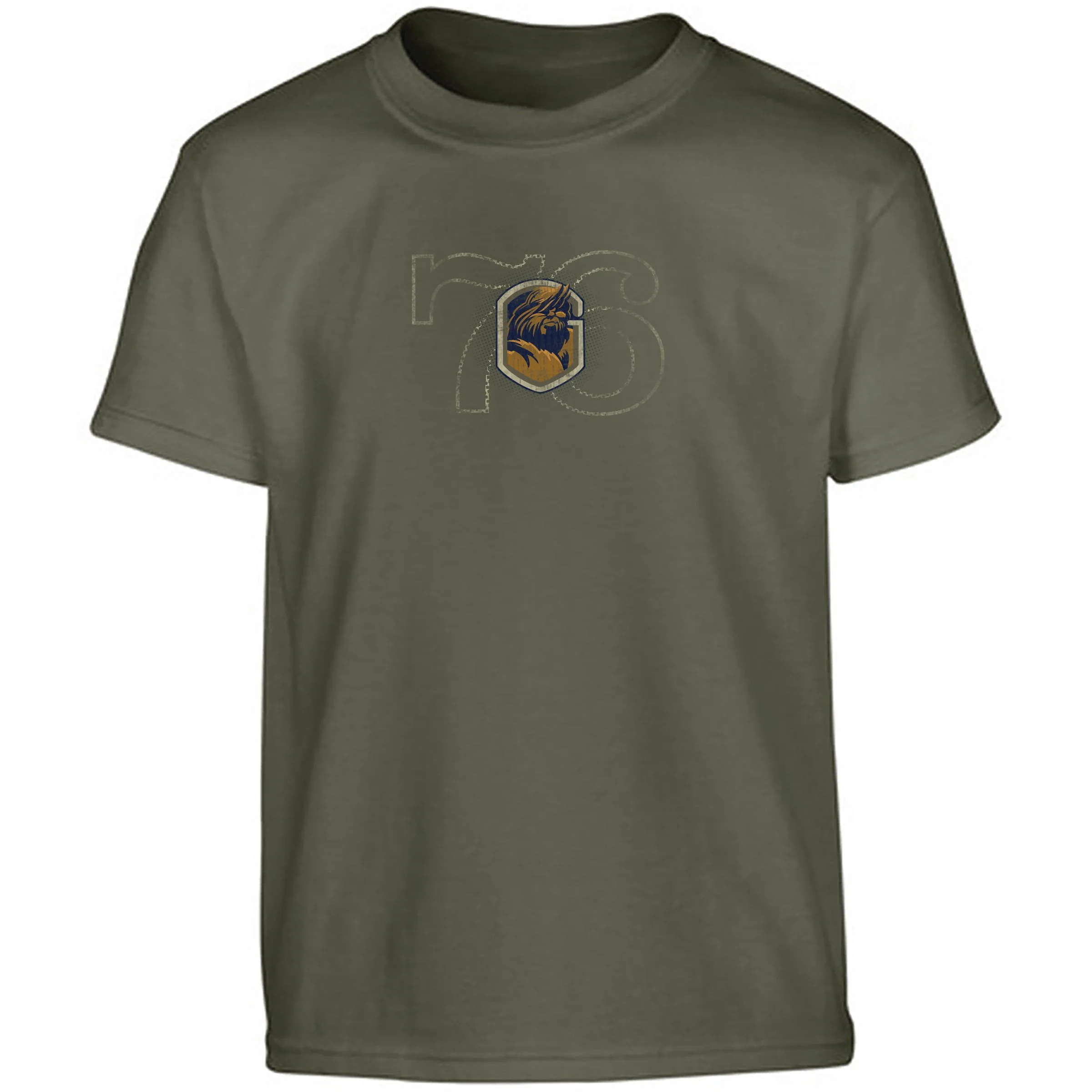
Scouting’s Camp Grimes adopted Bigfoot as a mascot. I created these t shirts for sale and promotion of the camp.
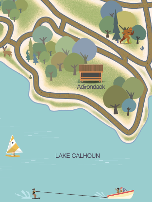
I was asked to create a fun, useful map for the scouts. We figured a light New Yorker style would be appropriate for both young scouts and parents.
Inspired by Mid-century Disney Park posters, I created this series of monster boards for sell and collection.
Normally, you wouldn’t associate “fun” with monsters. I thought that added to the challenge.
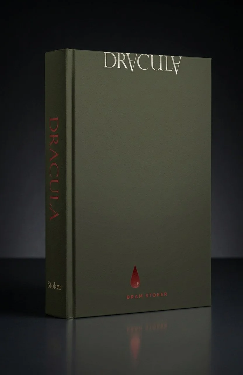
This series of book covers were designed to be graphically simple yet tell a conceptual story fitting the narrative.
Man, simple is hard.
In collaboration with North Carolina State Parks and Blue Cross and Blue Shield, Capstrat created a series of NC regional badges to promote beautiful area hikes from the mountains to the sea.
Currently unavailable as I search for a new store.
Based in Charlotte – the Queen City, Q Honey is a wholesome start up worthy of the buzz. Not worthy of the bad dad jokes though.
This series is used to conceptually tell the story of some of the Bible's greatest legends.
My goal was to make them as simple yet informative as possible.
Best-selling author Sheila Callaham commissioned four book covers to launch her new adventure series for young adults. She and I collaborated on the style of lead character Wells Worthy as well as the retro, adventure feel.
A fun, personal project celebrating the quirkiness of cool, retro items.
AIGA Raleigh created Casino Night as a fundraising event. These T-shirts were among items that were sold at the event to raise money for the local chapter.
I was asked to give the keynote address for AIGA Raleigh's first student portfolio review. To promote the event at area universities, I created this gutsy poster as a visual metaphor for dissecting one's portfolio.
My goal is to use limited shapes and palette to illustrate the summer of 1967 – a time that was anything by limited.
I ran out of month before finishing Good Morning and A Day in The Life. That would be one of the best songs to illustrate.
01 Sgt. Pepper’s Lonely Hearts Club Band
02 With a Little Help From My Friends
03 Lucy in the Sky with Diamonds
04 Getting Better
05 Fixing a Hole
06 She’s Leaving Home
07 Being for the Benefit of Mr. Kite!
08 Within You Without You
09 When I’m Sixty-Four
10 Lovely Rita
11 Monterey Pop Festival
I designed and illustrated covers for a series of “music to write by” CDs. Aural inspiration!
My friends at Teaching That Makes Sense really know how to reach young writers. So much fun working on these.
Every week, I create an illustration to celebrate the tastiest of all days – Taco Tuesday. I use this commitment to explore materials, techniques and concepts that help me grow. And spread the awesomeness of tacos.
To get more of your visual fill of tacos, follow me on Instagram
I use the Lunar New Year as inspiration to explore new techniques. My goal is to see how weird I can make these little spots while retaining the elegance of the holiday.
Classic Graphics is a top printer in the country. They have an annual tradition of hosting a barbecue for agencies and friends. Our team at Capstrat has been commissioned several times to create promotional posters and T-shirts.
Here are a few of mine.
This illustration was created to accompany an article about the need for healthy clinical research volunteers. The article points out many safe opportunities in science for the average person.
And it’s kinda funky.
This illustration promoted an article about the magic of mobile technology and touch navigation.
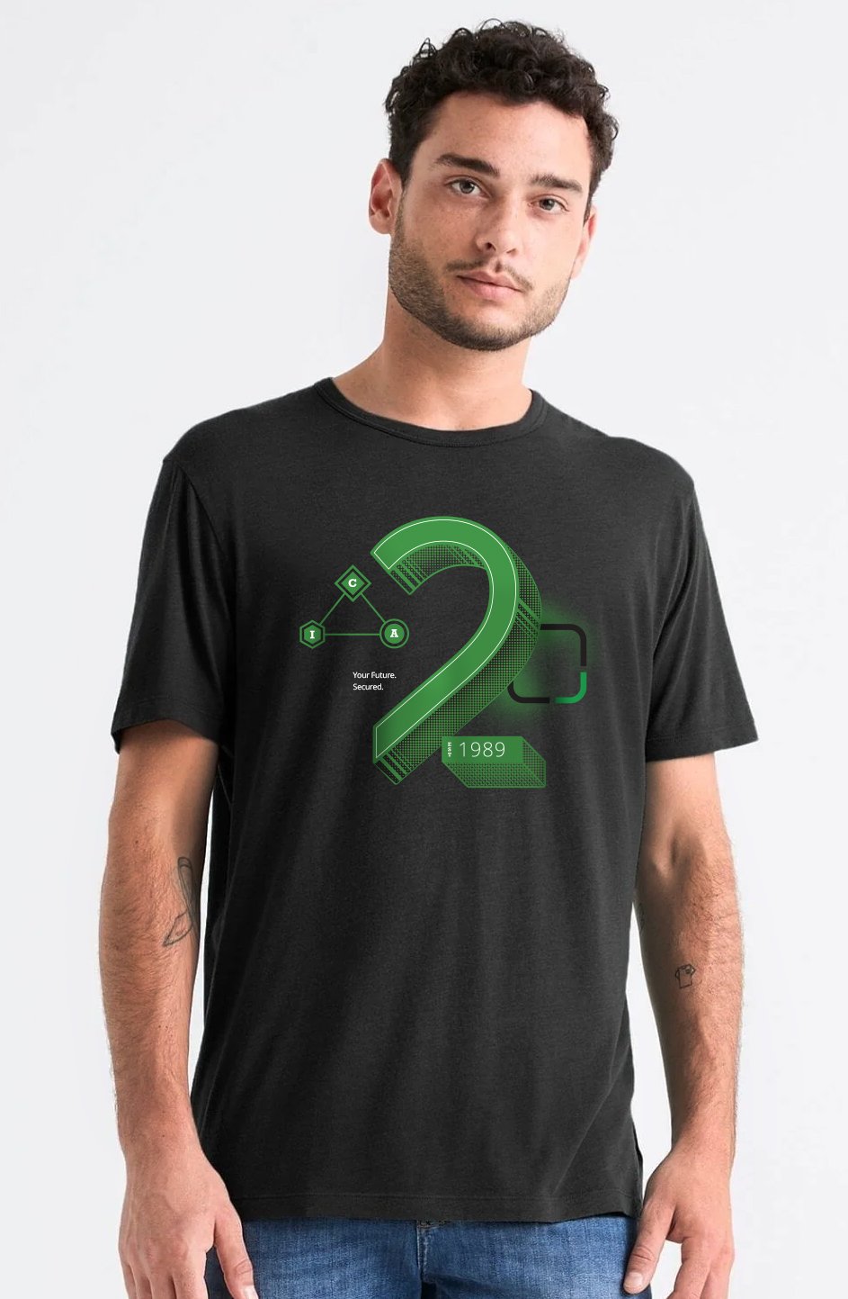
ISC2 is the world’s largest member association for cybersecurity professionals. As part of their team, I collaborated to create cool merch for sale.
This illustration was created for a suite of essays about the financial impact of games.
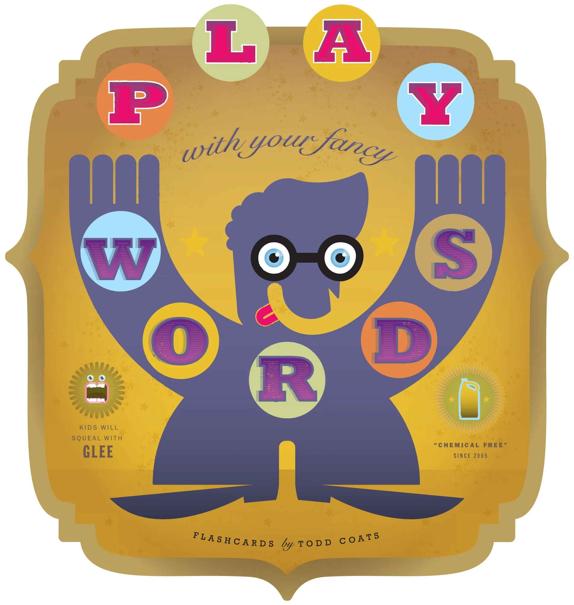
This personal project started to help my little daughter understand some grammatical figures of speech. Granted it went a little overboard as I made a flash card for each letter of the alphabet. I hope to shop this around for licensing.
Two other designers and I were commissioned to produce a series of promotional posters for superstar printer, Classic Graphics. The objective was to promote the company's new 40" press. Our only agreement was to celebrate the number 40. I chose a practical and public service application. Because with the undead…well you never know.
Occhi Felici is Italian for "Laughing Eyes." I designed and illustrated these two options for the product to conceptually show that feeling.
And this limoncello would definitely give you laughing eyes.
Rethink is a poster show by AIGA Raleigh. Creatives were commissioned to promote small, yet sustainable changes that may have a large impact on our environment. I chose simple, everyday changes we can make around water use.
Cindy Lou’s is a small cannery based in Wake Forest, North Carolina. They specialize in canning small batches of pickles, apple butter, peach salsa and spicy peach jam.
A series of playing cards I have created to celebrate to wonderful kitschiness of tabloid celebrities. See if you can catch all of the cheesy visual puns.
This mark was created for use by the East Coast Game Conference. It's a visual puzzle declaring, "Innovate or Die."
In honor of toys from my childhood, I created this series of serigraphs for sell and collection.
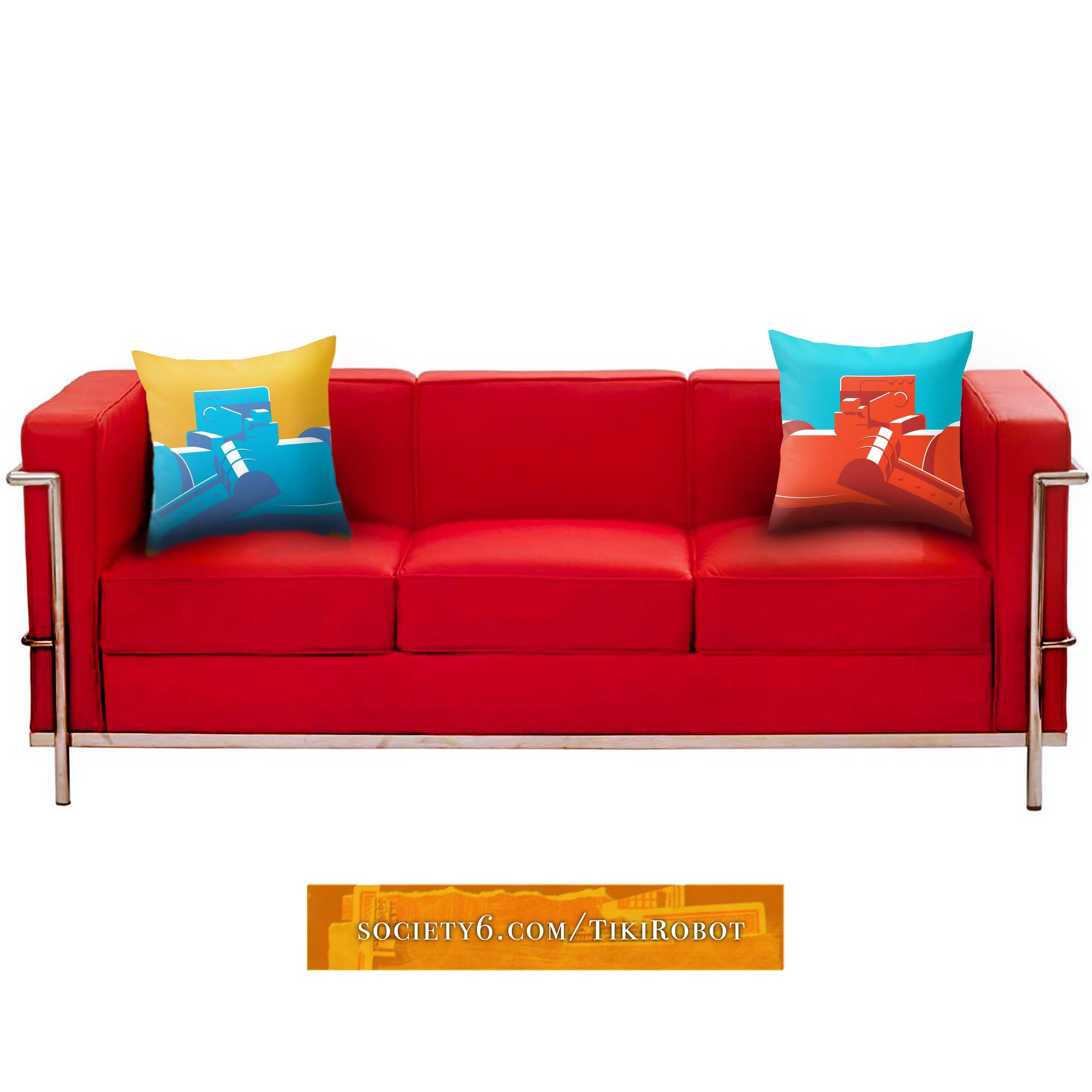
Wanna see more and even buy a thing or two? https://society6.com/tikirobot
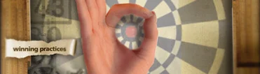
GlaxoSmithKline reinterpreted the sales process as Winning Practices. It was based on being real and valuable. The pastiche look I created was meant to be urgent and very hands-on.
Local honey is always the best.
I created this pin-up style package to showcase the goodness that’s as good as your hometown sweetie.
This poster was created for the AIGA Studio Tour.
Our firm, Capstrat, had just moved into a brand, spanking new space. Hence the theme.
01 Risk is Risky, theme meeting
02 Oktoberfest, themed fundraising event
03 Bestow Baked Goods
04 Prazone, Christian-themed streetwear
05 Shoreline Productions, video production
06 Cherokee, investment reclamation
07 Tank, a skate park
08 Mariposa Books, a publishing company
09 Fight For Peace, t-shirt graphic
10 Meeting in a box, that sorta says it all
11 Magic 8 Rebate, for Coffeemate
I use the Lunar New Year as inspiration to explore new techniques. My goal is to see how weird I can make these little spots while retaining the elegance of the holiday.
I use the Lunar New Year as inspiration to explore new techniques. My goal is to see how weird I can make these little spots while retaining the elegance of the holiday.
Author Sheila Callahan and I collaborated on a book cover to be both mysterious and clue-filled. "Truth Runs Deep" is about a police chief embroiled with the Catholic Church while solving a slew of related murders. Issues of religious and sexual intolerance begin to emerge in this fast-paced, suspense-filled mystery.
While I was leading the Glaxo Wellcome (now GSK) design team, I was asked to do a speaking engagement. My team made some incredible work so I thought it would be fun to include them, too.
We happened to all be into professional wrestling at the time, so it was natural to develop a mailer/poster that showed that kitschy love. As the mailer unfolds, so does the drama that in-house design teams have to wrestle with.
Once opened, the mailer became a sweet poster.
This is a series I’m working on inspired by face cards. In thinking about historic events of famous cities, they are equal parts good and bad. I tried to show that is a simple way.
I use the Lunar New Year as inspiration to explore new techniques. My goal is to see how weird I can make these little spots while retaining the elegance of the holiday.
I use the Lunar New Year as inspiration to explore new techniques. My goal is to see how weird I can make these little spots while retaining the elegance of the holiday.
I use the Lunar New Year as inspiration to explore new techniques. My goal is to see how weird I can make these little spots while retaining the elegance of the holiday.